Terra
A decision engine for comparing places to live.
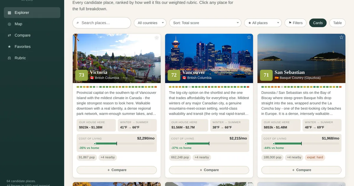
Terra is a tool for making a hard, sprawling decision - where to live - with something better than gut feel and a dozen browser tabs. It scores a curated set of candidate locations against a weighted rubric of the things that actually matter to a household, so the comparison is explicit, adjustable, and repeatable.
How it works
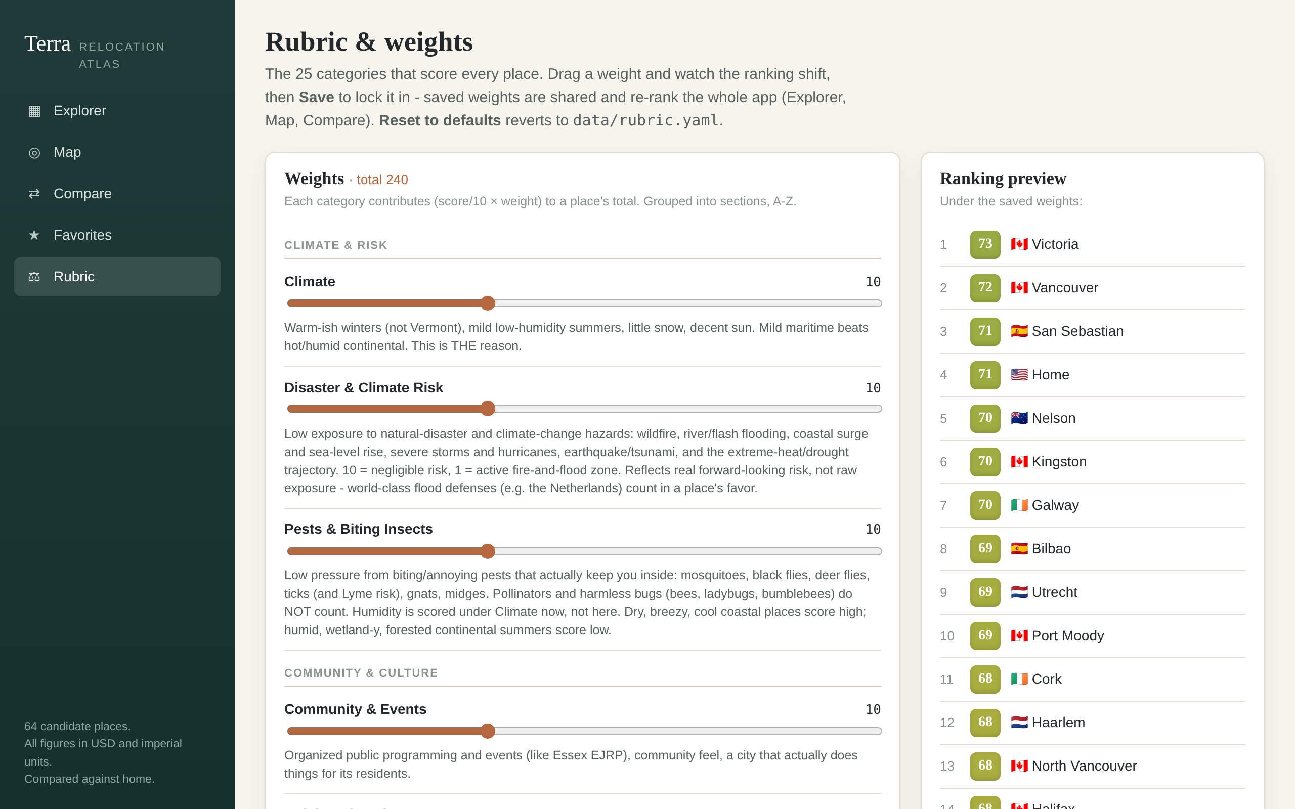
- A weighted rubric. Dozens of locations are scored across two dozen-odd categories, grouped into sections (climate and risk, nature, getting around, services, and so on). You set the weights, so the ranking reflects your priorities rather than a generic “best places to live” list - and you can re-weight and instantly see the order change.
- Real data behind each score. Categories are backed by concrete inputs - climate normals, cost-of-living and housing figures, tax modeling - rather than vibes, so a high score traces back to numbers you can inspect.
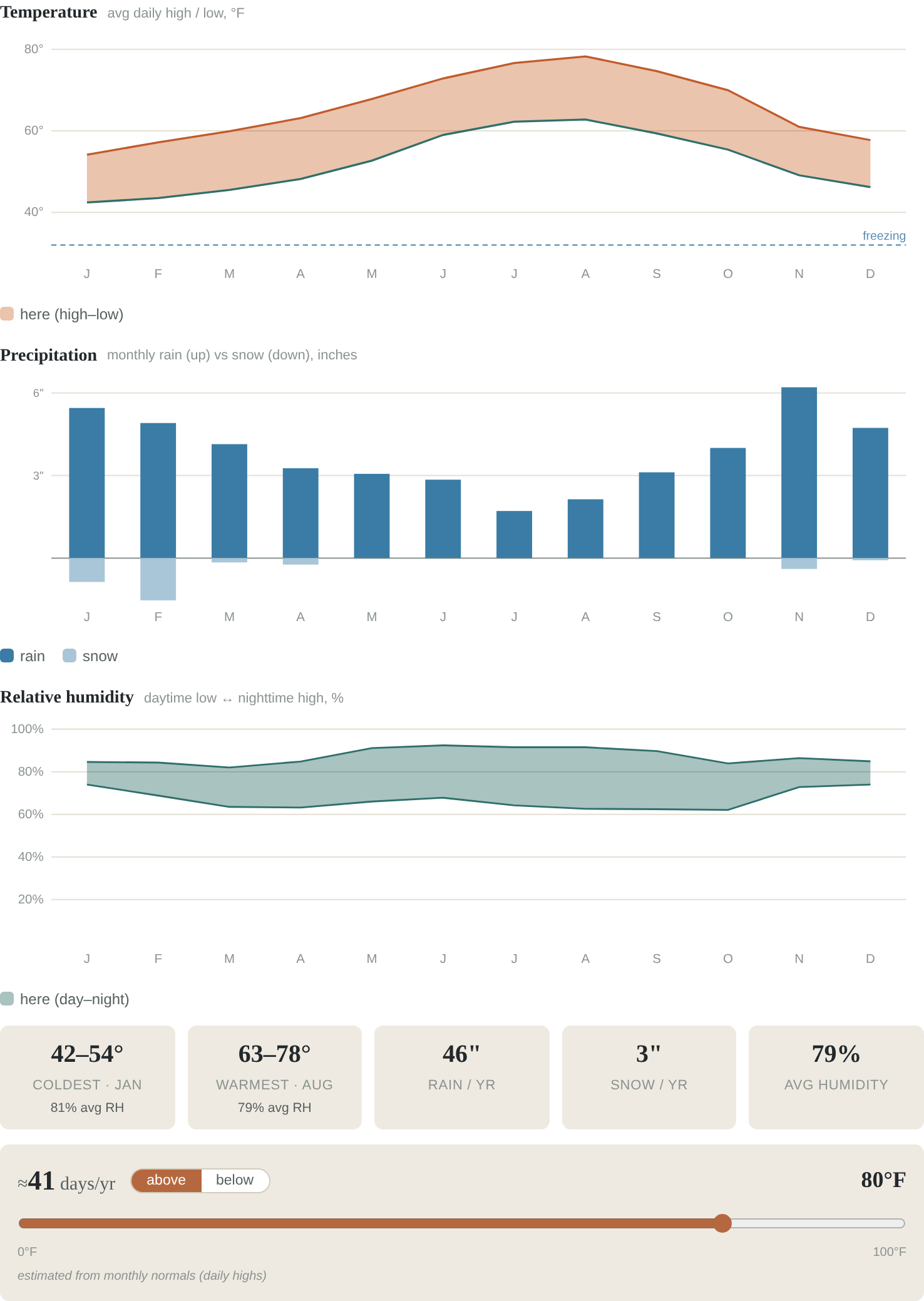
- Built to compare, not just rank. Side-by-side views and hand-drawn charts (climate curves, cost breakdowns) make the trade-offs between two finalists legible, which is where this kind of decision actually gets made.
Using it
- Weights are sliders you drag, and the ranking re-sorts live right next to them as you move - no submit, no reload - so you can feel how much a given priority actually swings the order. Committing the weights is a separate Save step that re-ranks the whole app.
- Scored places show up as photo cards or a dense sortable table; you sort by the total or any single category, and one red-to-green color ramp is reused across every cell, badge, and at-a-glance fingerprint strip so it all reads the same way.
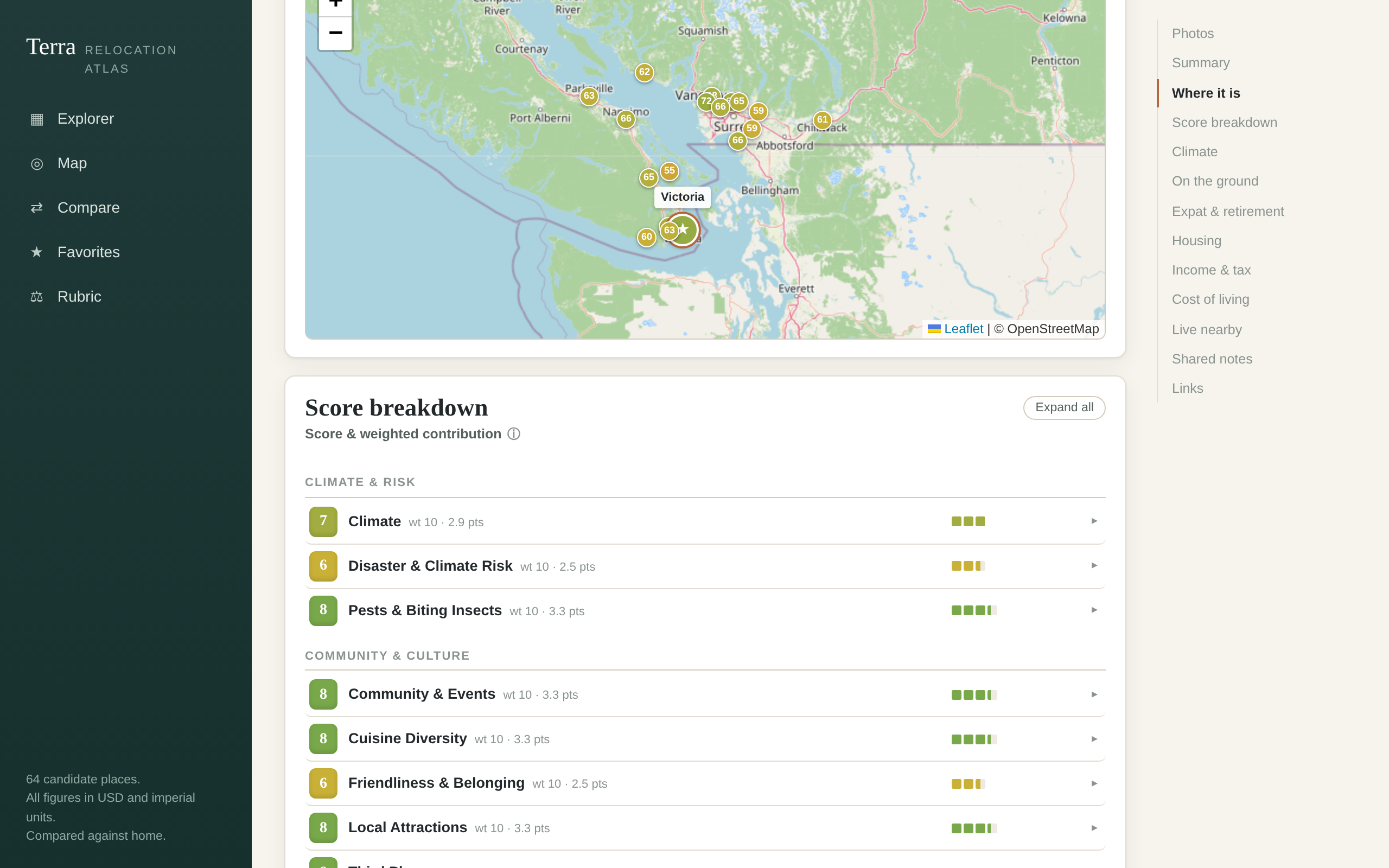
- A place’s detail page opens with its score broken down category by category. Each row carries a small run of squares - one square per point of the 100-point total - sized by that category’s weighted contribution (its score times its weight). A long run means that category is really driving the total; a near-zero-weight one shrinks to a single square. It’s a way to see, at a glance, what’s actually moving the number rather than just reading two dozen 0-10s.
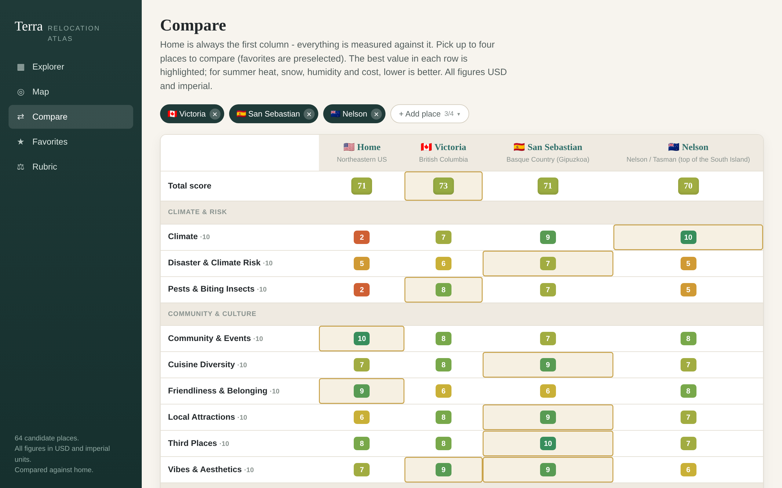
- Comparing pins one place as a fixed reference column and measures up to three others against it side by side. The best value in each row is highlighted, and the highlight flips for metrics where lower is better, so “best” always means better.
- The charts are hand-drawn SVG - climate bands, a cost meter centered on the reference, a “days per year above X” slider - each with its own “vs reference” overlay, for the trade-offs that don’t collapse into a single score. The whole view state lives in the URL, so a particular comparison is just a link.
Notes
It’s a client-heavy React/TypeScript app with a data pipeline feeding the rubric, run privately for my own household’s use. The interesting engineering is in the scoring model and keeping the underlying datasets honest and current. The screenshots here are from a built-in “showcase” mode that flattens the weights and redacts the one personal category, so the public page shows the tool without publishing my own priorities.
Screenshots
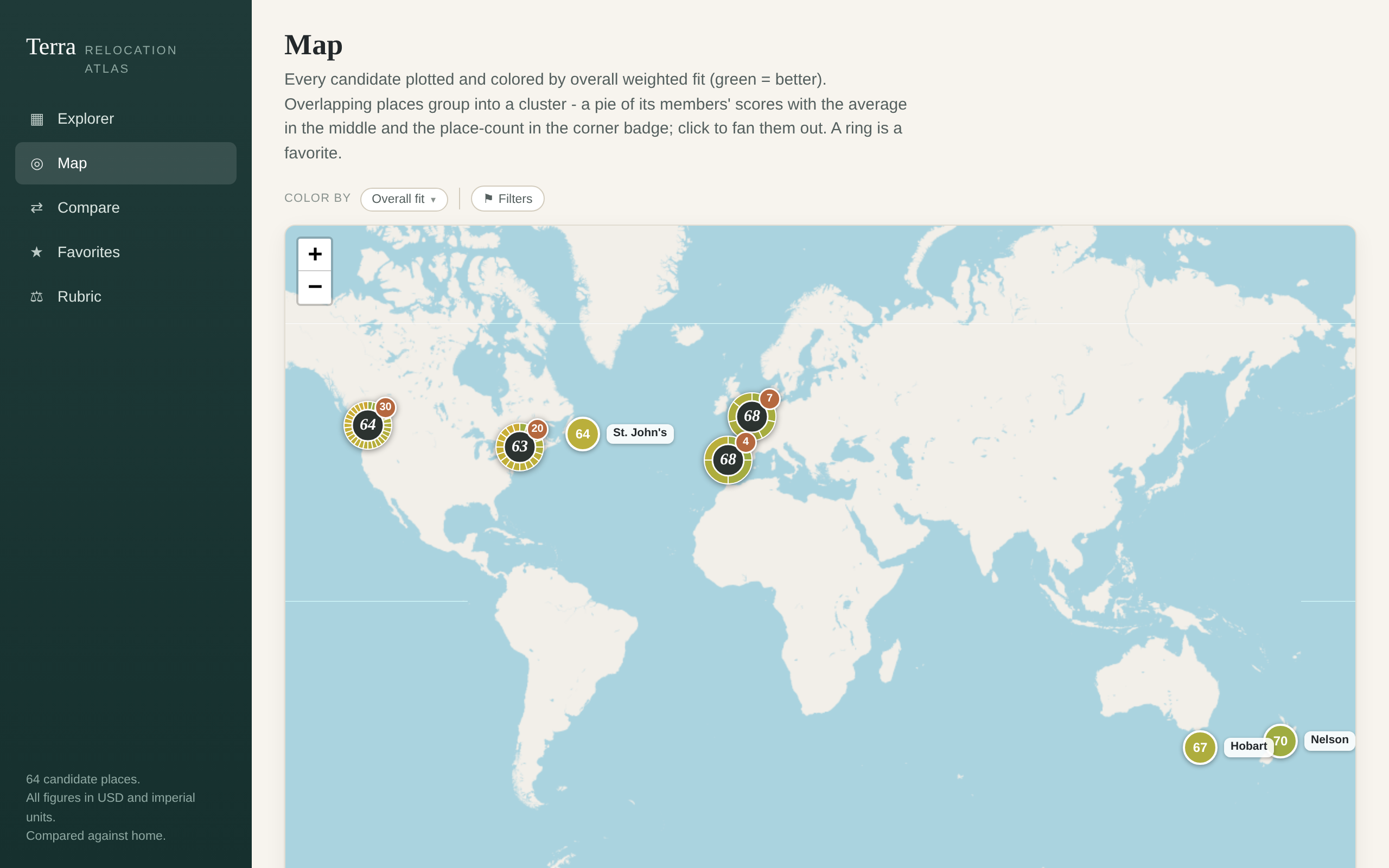
snapshot
reflects relocation-explorer@753a46ecaptured Aug 14, 2026